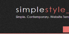
A Non Responsive Website
Please resize your browser window to see how the website doesnt adjust. Perhaps make it the shape of a mobile phone screen. Take a look at the image above and how you have to scroll across to read all the text written here
See how part of the menu at the top disappear.
images can be placed on the left, in the center or on the right:
Lorem ipsum dolor sit amet, consectetur adipisicing elit, sed do eiusmod tempor incididunt ut labore et dolore magna aliqua. Ut enim ad minim veniam, quis nostrud exercitation ullamco laboris nisi ut aliquip ex ea commodo consequat. Duis aute irure dolor in reprehenderit in voluptate velit esse cillum.
Lorem ipsum dolor sit amet, consectetur adipisicing elit, sed do eiusmod tempor incididunt ut labore et dolore magna aliqua. Ut enim ad minim veniam, quis nostrud exercitation ullamco laboris nisi ut aliquip ex ea commodo consequat. Duis aute irure dolor in reprehenderit in voluptate velit esse cillum dolore eu fugiat nulla pariatur.
Browser Compatibility
This template has been tested in the following browsers:
- Internet Explorer 9
- FireFox 25
- Google Chrome 31